![]()
Buttonwood Rebrand
Client: Buttonwood
Role: Creative Direction / Brand Strategy / Design
Problem
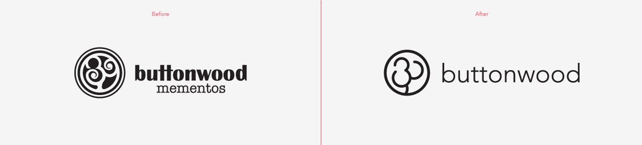
Recently Buttonwood went through a change in ownership and it was time to re-examine the brand. As Creative Director I was tasked with creating a fresh and invigorated direction for a new and more cohesive brand. Not only was the branding changed but the organization as whole rethought its focus. The name was changed from Buttonwood Mementos to simply Buttonwood, to allow for a broader customer and product base. The newly minted Buttonwood is a woman owned company grounded in customer service.
Solution
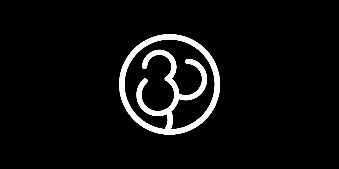
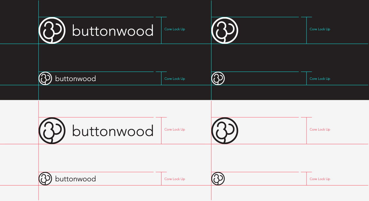
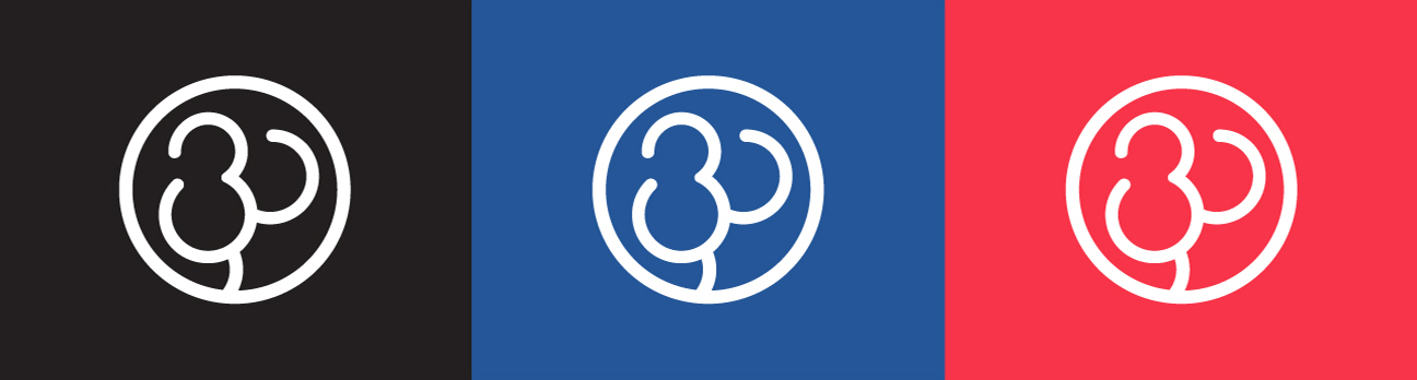
Our previous visual identity was not without equity, so the new logo was designed as an evolution of the previous mark. The mark symbolizes a tree formed by the intersection of the “B” and the “W” from Buttonwood. The fabled story of the Buttonwood Agreement signed on May 17, 1792 under a buttonwood tree outside 68 Wall Street, is the origin of the company name. It serves a deeper meaning, in the early days Buttonwood served mostly elite financial institutions (Goldman Sachs, Barclay, JPMorgan, etc.) and the Buttonwood Agreement was the birth of what was to become the New York Stock Exchange. The new mark is a more elegant and modern solution with a lighter more consistent line weight and rounded edges.
Results
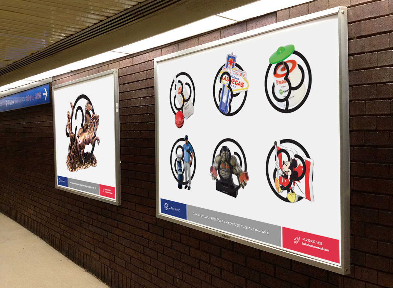
My team and I designed every touch point for the brand including the visual identity system, integrated marketing, motion graphics, packaging, web site redesign and more. We created these assets from the core brand positioning we created and the visual guidelines and language we developed. Based on months of research and design intended to bring a cohesive brand to life in alignment with customer needs and business goals.
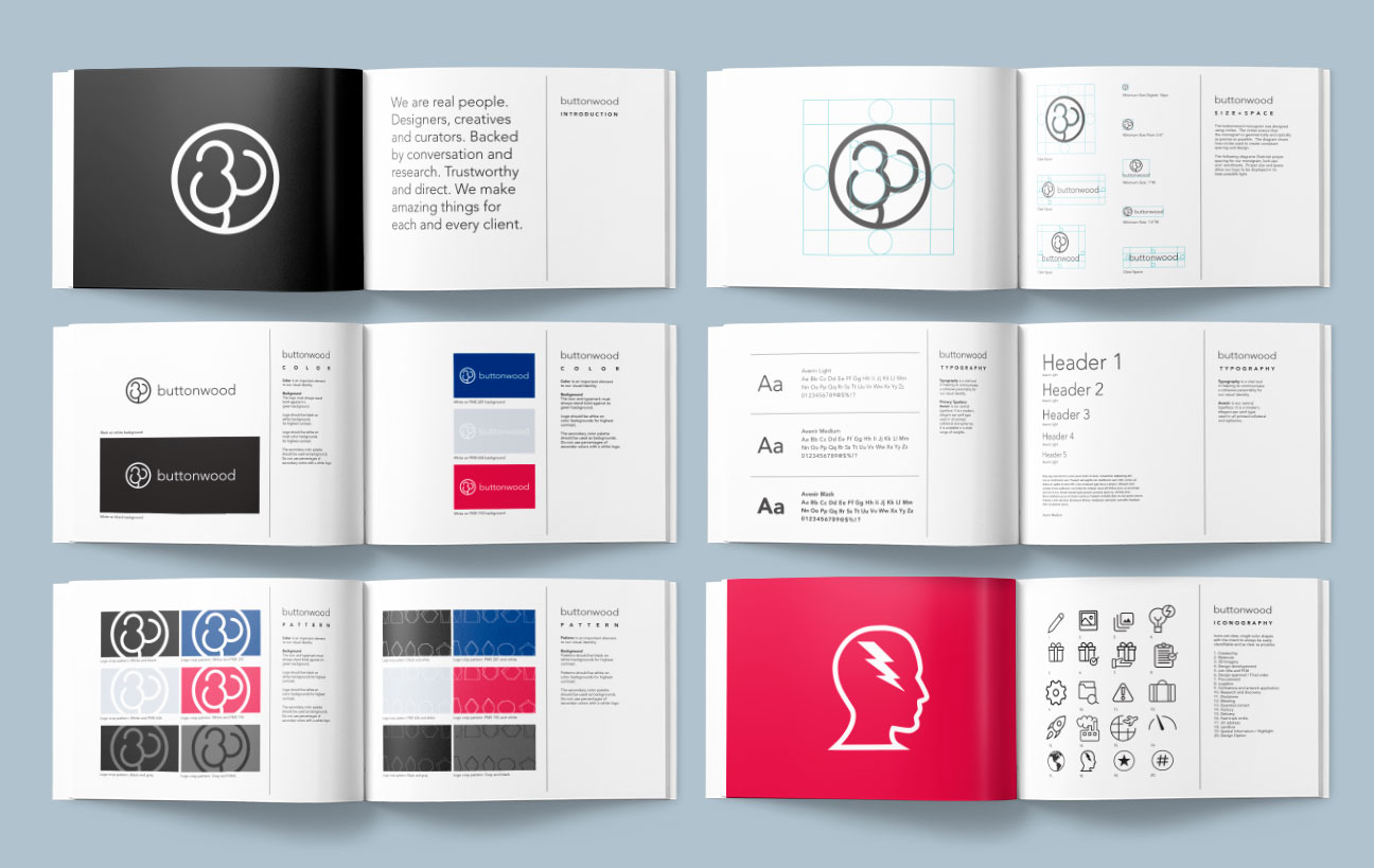
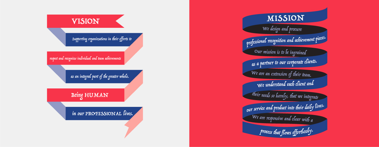
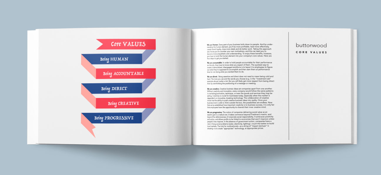
After months of research and iterations we were able to crsytalize our mission, vision, core values, and voice. At the forefront were Accountability, Creativity, and Transparency. They were always there, but needed to solidified and expressed in words and feelings before we could set to work on the visuals. Once the core ideas and language were in place we built a system to support them. For easy reference a style guide was created that outlines everything from logo and imagery usage, to color, typography, voice and photography. The guide serves as a tool for accountability and helps to unify and build enthusiasm in our teams.

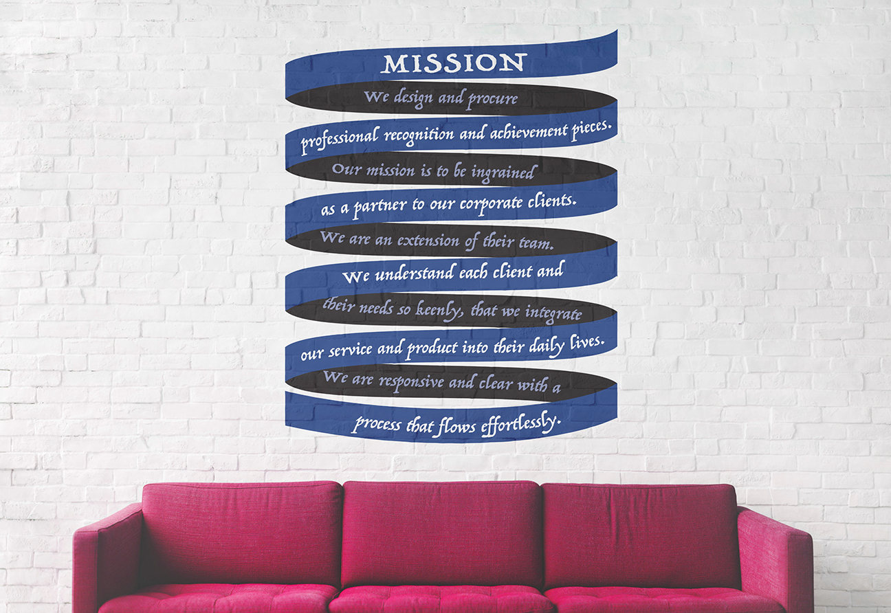
We painted our mission statement, vision Statement, and core values on the wall to get our employees excited and energized about helping and working with our clients. Not only is it a daily reminder of what we stand for, but its fun and creative. To create a holistic experience the employees need to be engaged and enthusiastic. End to end accountability also helps to promote a more customer centric business.
In line with our new identity photography, 3D, and motion all had to undergo changes. Photography and 3D took on cleaner, minimalistic backgrounds, allowing the products to shine through whether as digital prototypes or as finished pieces. Motion became an extension of this style.
![]()