Buttonwood Brand Design
Client: Buttonwood
Role: Creative Direction / Brand Strategy / Design
Problem
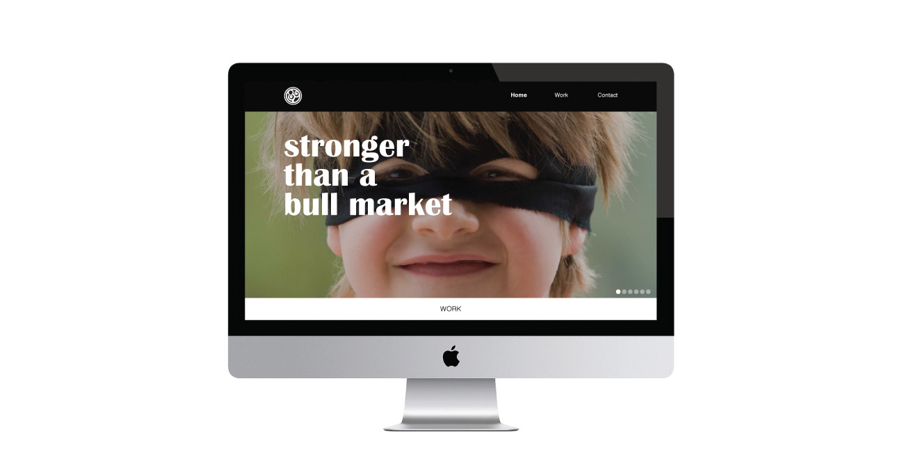
Buttonwood is a design firm that creates bespoke awards, mementos and corporate gifts for elite financial institutions and universities. As Creative Director I was tasked with creating the companies first visual identity. I designed every touch point for the brand from visual identity, web site, integrated marketing material to packaging and presentations

Solution
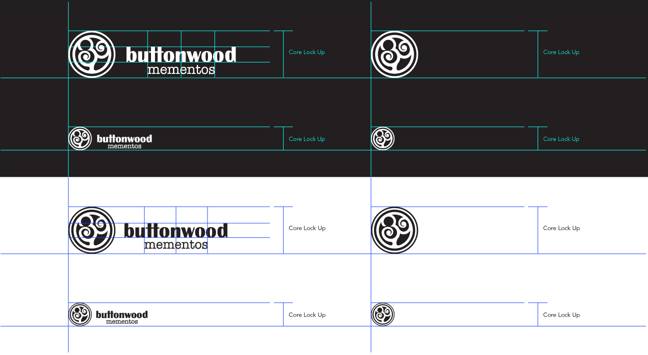
The mark symbolizes a tree formed by the intersection of the “B” and the “W” from Buttonwood. The fabled story of the Buttonwood Agreement signed on May 17, 1792 under a buttonwood tree outside 68 Wall Street, is the origin of the company name. It serves a deeper meaning, in the early days Buttonwood served mostly elite financial institutions (Goldman Sachs, Barclay, JPMorgan, etc.) and the Buttonwood Agreement was the birth of what was to become the New York Stock Exchange. I drew the original mark by hand to demonstrate the quirky creativity of the founder, who was a fore runner in the industry.

![]()


Results
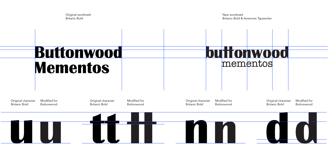
Before I came to Buttonwood the logo had been a work mark typed in Brittanica Bold. In order to preserve any brand equity I created a new word mark based on the old one using a modified version of the typeface. The result is subdued and elegant. Colors were chosen to be business like yet bold and playful.


